Rich Content Formatting
Buttons Macro
Buttons Macro
What It Does
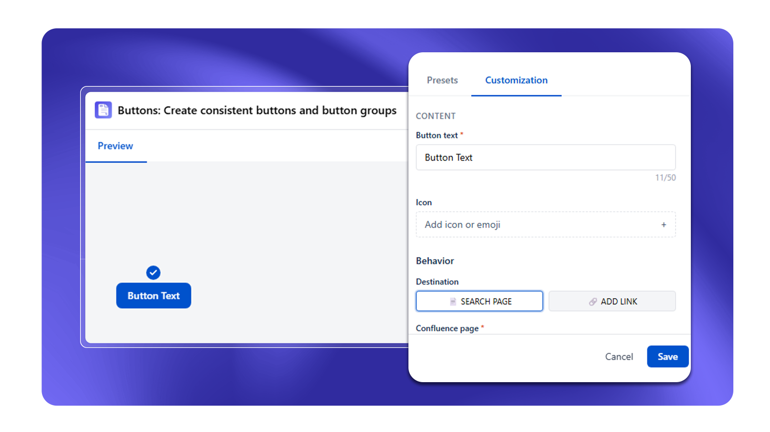
The Buttons macro creates styled call-to-action buttons on any Confluence page. Buttons can link to internal Confluence pages, external URLs, email addresses, or anchors on the same page.
Configuration Options
Each button in the macro has these settings:
| Setting | Options |
|---|---|
| Button text | Label shown on the button (max 50 characters, required) |
| Icon | Optional icon from the built-in Lucide icon library |
| Icon position | Before, After, or Only (icon-only button) |
| Style | Filled, Outlined, Subtle, Link |
| Shape | Square, Rounded, Pill |
| Size | S, M, L |
| Font family | Arial, Calibri, Georgia, Verdana, Trebuchet MS, Times New Roman, Palatino, Tahoma, Courier New, Impact |
| Font weight | Regular, Semi-Bold, Bold |
| Hover effect | None, Elevated (lifts up), Shrink |
| Background color | Color picker (Filled style only) |
| Text color | Color picker |
| Alignment | Left, Center, Right |
| Destination | Search Confluence page or Add link (external URL) |
| Open in new tab | Yes / No |
The macro also includes a Presets tab with 30+ pre-designed button styles.
Adding Multiple Buttons
All buttons live inside one macro instance. Use the + Add Button control to add more buttons. When multiple buttons exist, Group Settings appear:
| Group Setting | Options |
|---|---|
| Orientation | Horizontal, Vertical |
| Group Alignment | Left, Center, Right, Space Between, Space Around |
Common Use Cases
- "Download" or "Get Started" CTA at the top of a documentation page
- Links to related systems (Jira board, Confluence space, external tool) at the bottom of a runbook
- Navigation buttons replacing manually written "see also" links
- Step-navigation in onboarding pages: "Previous Step" and "Next Step"
Best Practices
- Keep button labels short (2–5 words)
- Use Filled style for the main action, Outlined for alternatives
- Use icon-only buttons (Icon position: Only) for compact toolbars or social media links