Custom Charts Gadget
Chart Types Guide
Detailed guide to all 10 chart types available in Custom Charts, with examples and best practices.
Pie Chart
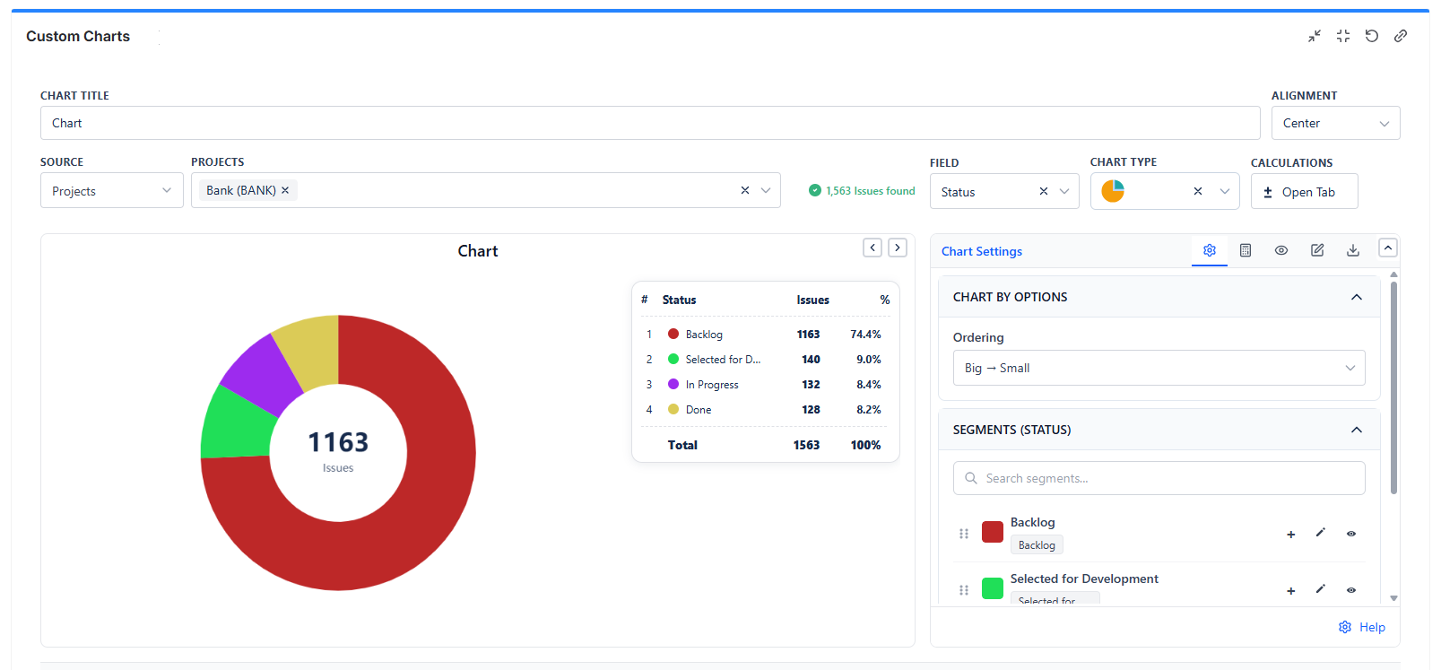
When to Use
- Showing how a whole is divided into parts
- Displaying percentages and proportions
- Comparing relative sizes of categories
Best For
- Status distribution (To Do: 30%, In Progress: 45%, Done: 25%)
- Bug severity breakdown
- Work allocation by team member
Best Practices
- Use 2-7 segments for readability
- Order segments by size (largest to smallest)
- Use contrasting colors
Bar Chart (1D)
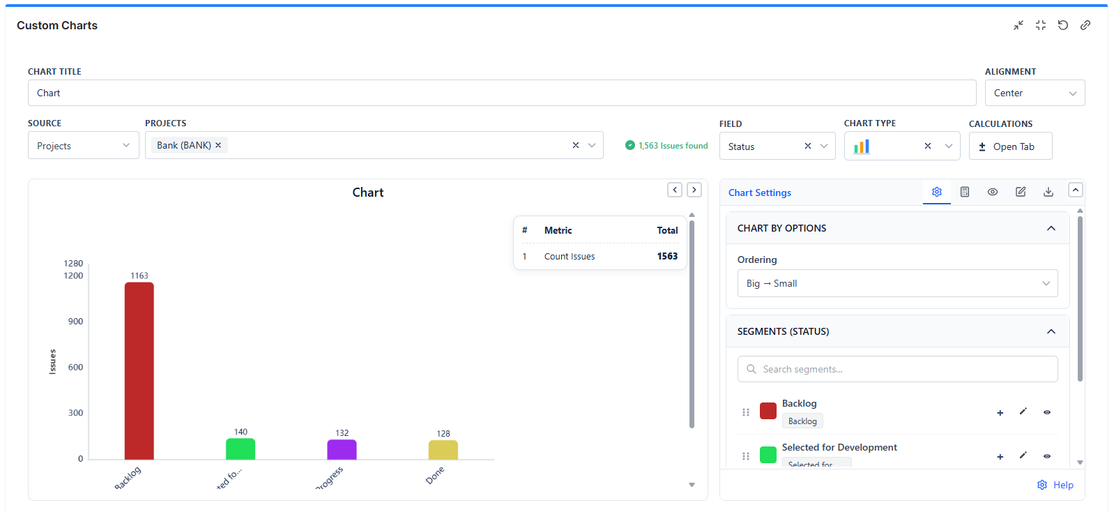
When to Use
- Comparing values across categories
- Showing rankings or distributions
Best For
- Issues per team member
- Bugs per component
- Story points by sprint
Grouped Bar Chart (2D)
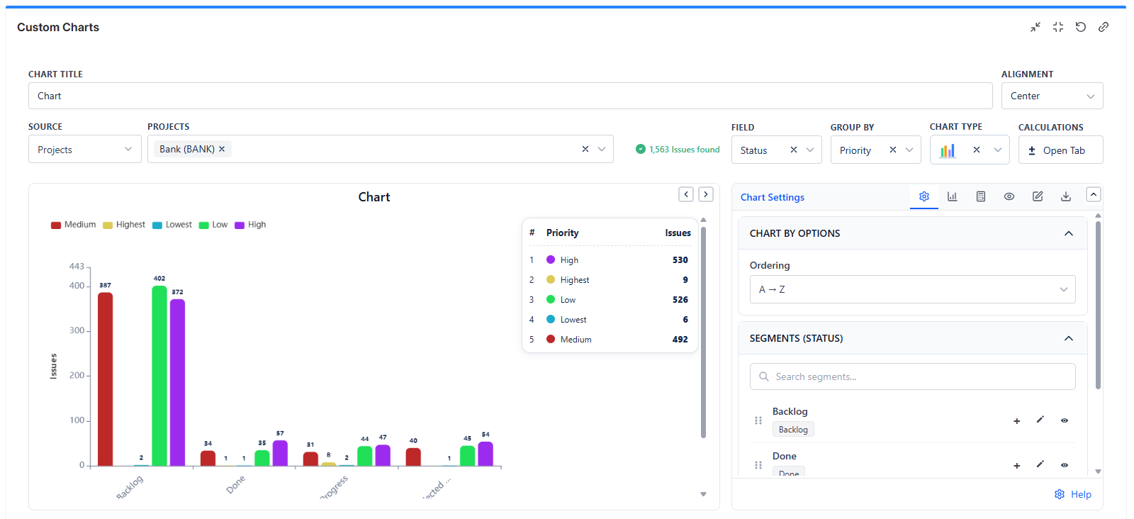
When to Use
- Comparing multiple series side-by-side
- Showing breakdown within each category
Example: Chart By: Status | Group By: Issue Type
Result: For each status, see separate bars for Stories, Bugs, Tasks side by side.
Stacked Bar Chart (2D)
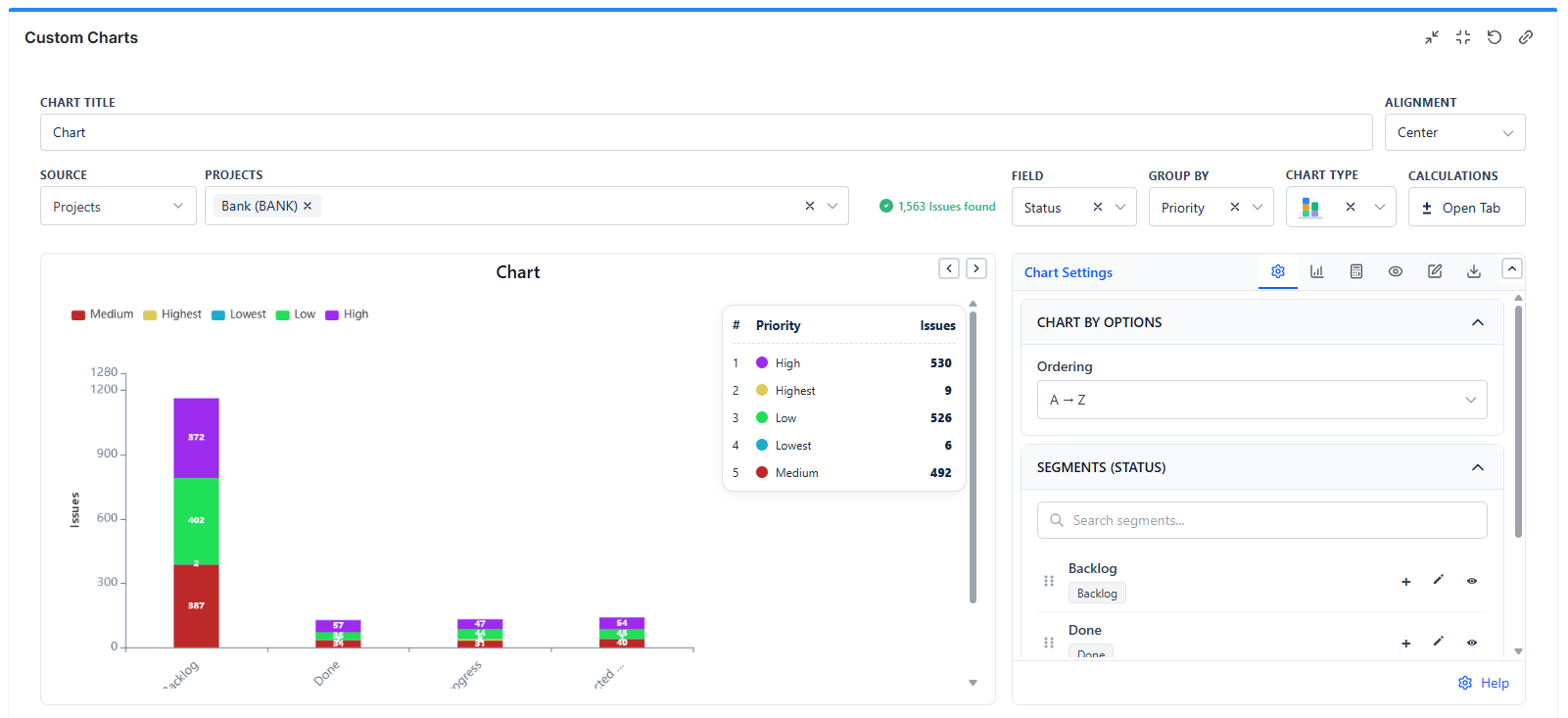
When to Use
- Showing composition within categories
- Comparing totals AND breakdowns
Example: Chart By: Sprint | Group By: Priority
Result: Each sprint shows a single bar with priority levels stacked.
Line Chart (1D)
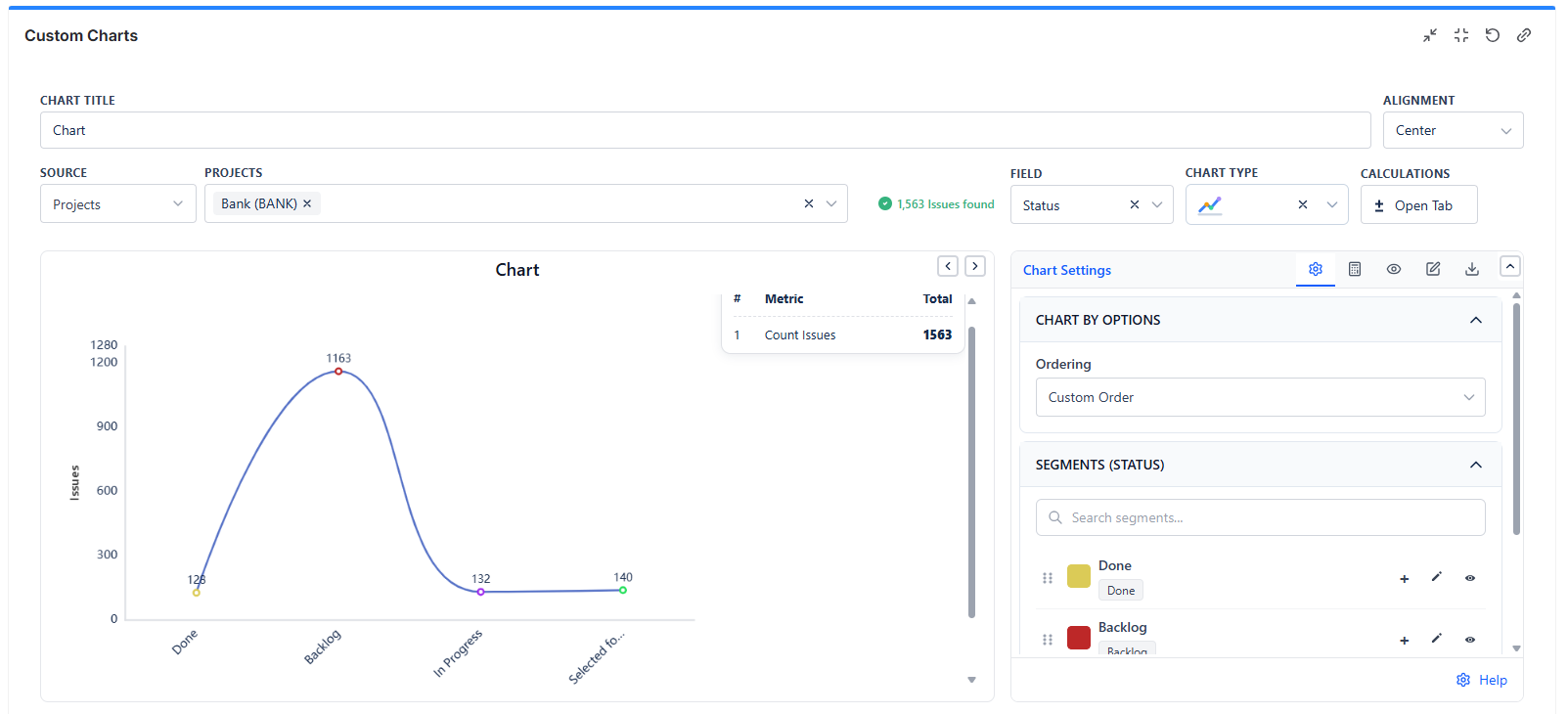
When to Use
- Showing trends over time
- Displaying progression or change
Best For
- Issues created per week
- Velocity trend across sprints
- Bug count over time
2D Line Chart
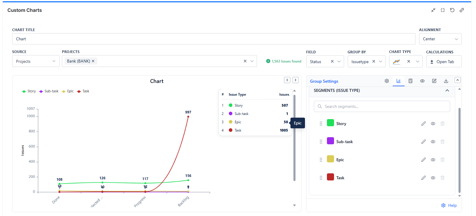
When to Use
- Comparing multiple trends simultaneously
- Showing related metrics over time
Example: Chart By: Week | Group By: Issue Type
Result: Separate lines for Stories, Bugs, and Tasks on the same time axis.
Table Chart (1D)
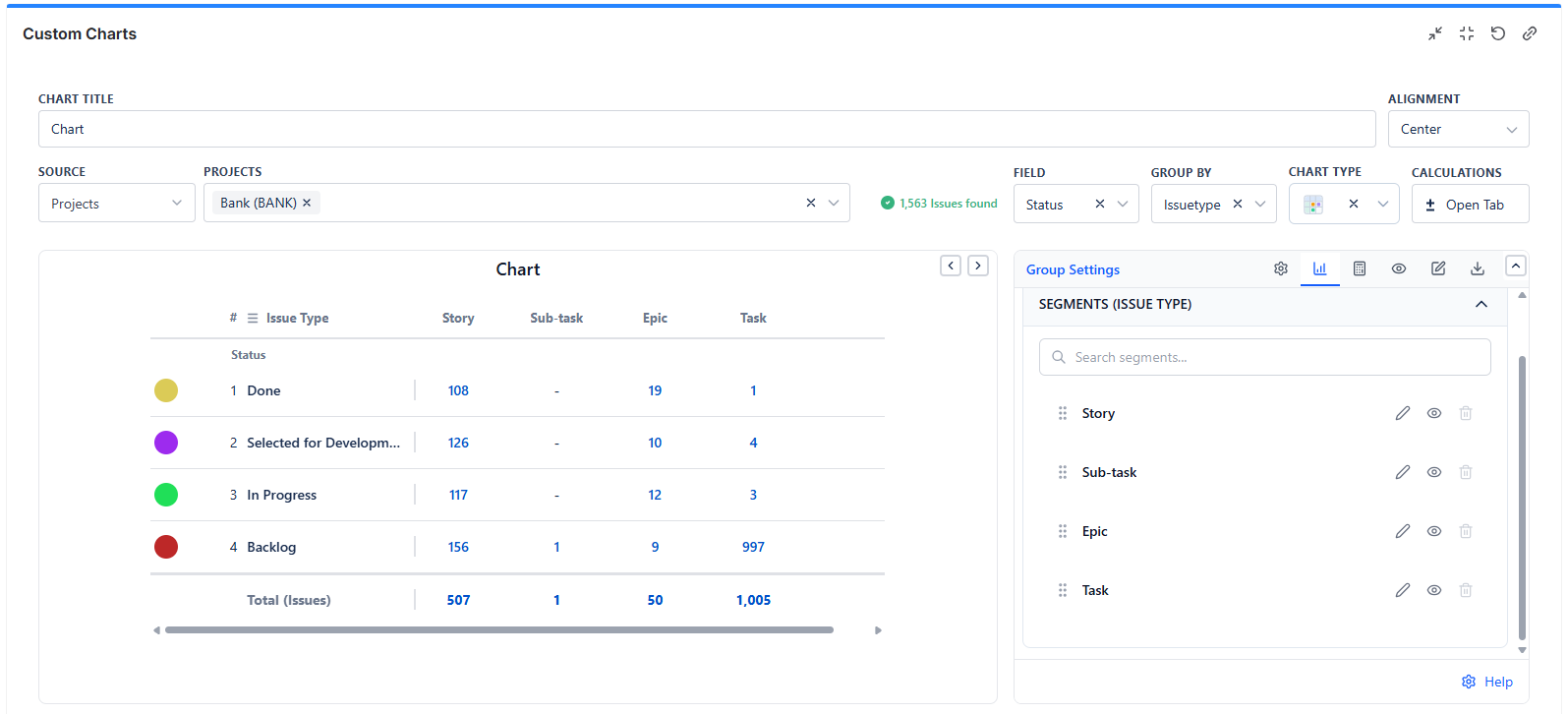
When to Use
- Displaying exact numbers
- When precision matters more than visualization
2D Table Chart
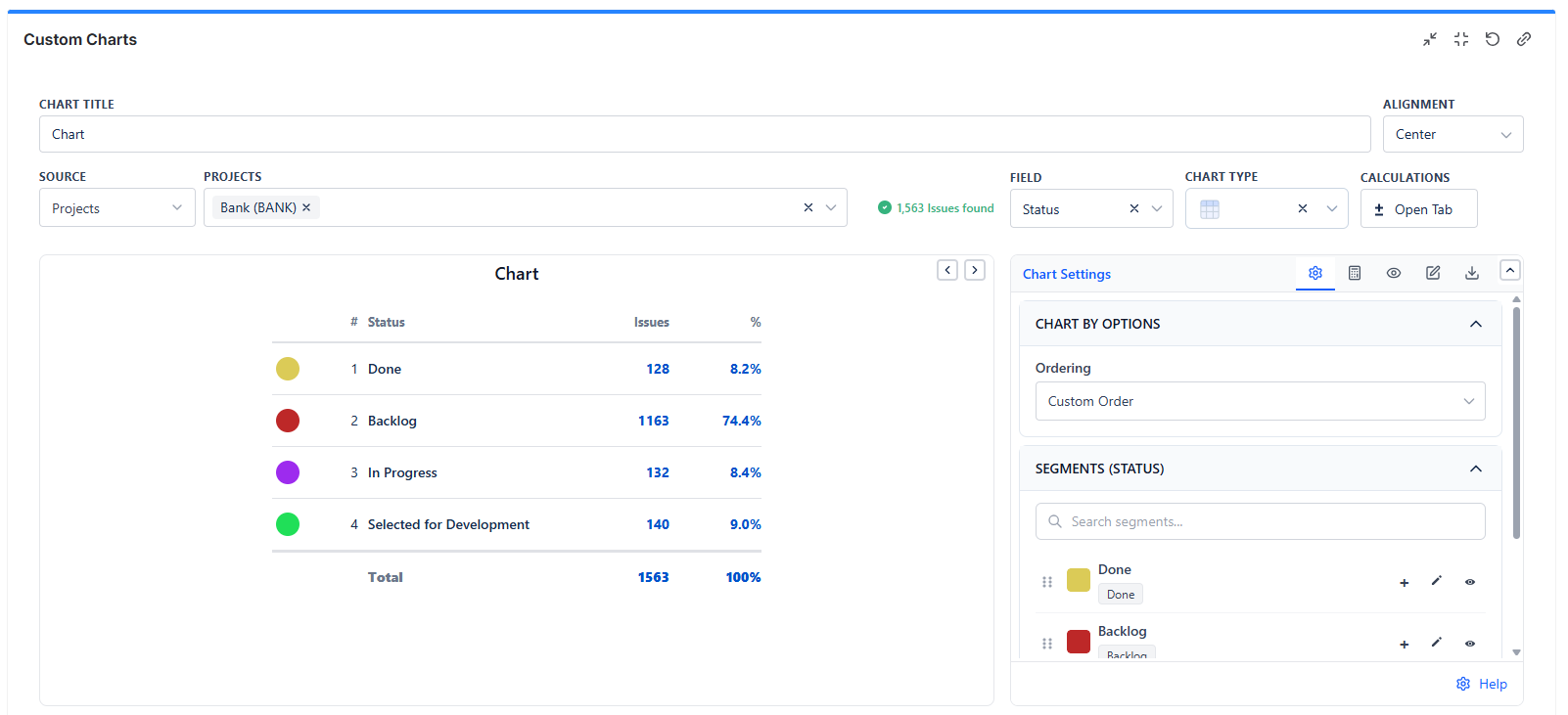
When to Use
- Showing data matrix with two dimensions
- Cross-tabulating two fields
Example: Chart By: Assignee | Group By: Status
Result: A table where rows are team members, columns are statuses, and cells show the count.
Funnel Chart
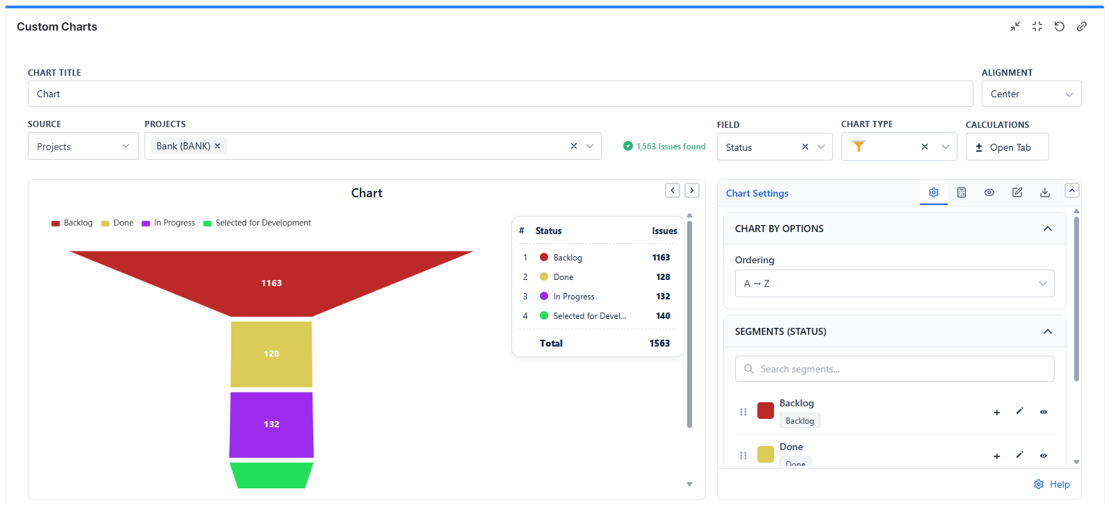
When to Use
- Showing stage-based progression
- Visualizing conversion or workflow
Best For
- Support ticket funnel (New → Triaged → Working → Resolved)
- Sales pipeline stages
Tile Chart
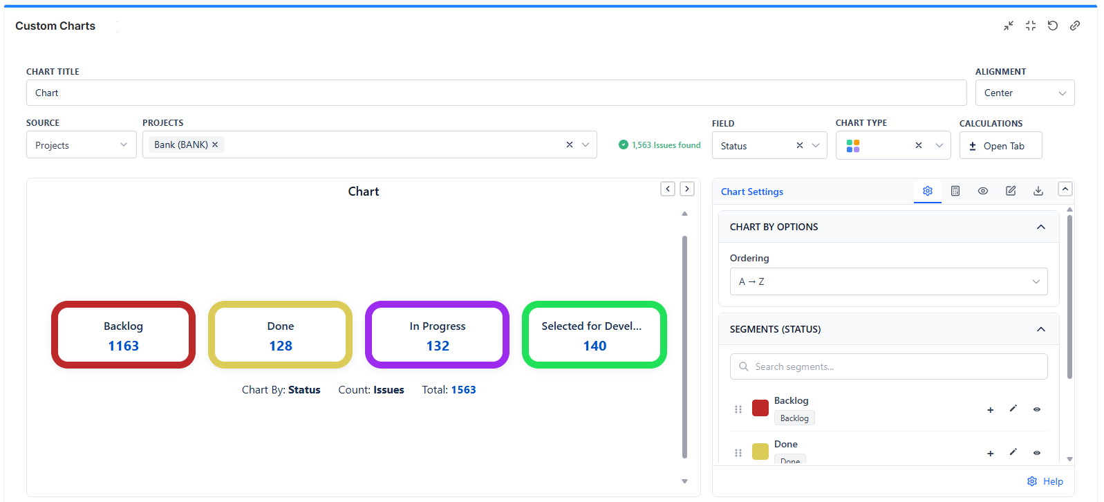
When to Use
- Displaying single KPI metrics
- Creating dashboard scorecards
Best For
- Total open issues
- Story points remaining
- Bugs this week