Custom Tabular Report
Grid View
Grid view displays each Confluence content item as a visual card in a responsive multi-column grid. It is ideal for dashboards, team directories with profile photos, and any report where visual browsing is more important than data comparison.
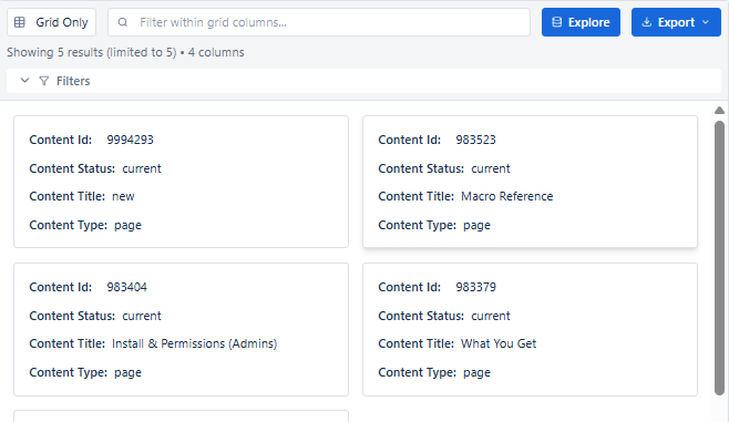
Key Features
| Feature | Description |
|---|---|
| Responsive grid layout | Cards arrange in multiple columns and adapt to page width |
| Image block - prominent | Images render as the card's visual focus (e.g. profile photo, thumbnail) |
| Link block | Card title or image can be a clickable link to the Confluence page |
| Pagination | Navigate large grids with Previous/Next controls |
| Inline search | Filter visible cards by keyword |
| All column types supported | Basic, Image, Link, Collection, Regex, Text |
When to Use Grid View
- Team / people directories - profile photo + name + role in each card
- Visual content galleries - page thumbnails or attachment images
- Portfolio dashboards - visual showcase of projects or deliverables
- Topic hubs - cards for each topic area with a preview image and link
- Anywhere a visual, browsable layout is better than a row-based table
Configuring Grid View
- Set Report Type to Grid in the header dropdown.
- Load history expansion for profile picture fields.
- Open the Columns tab - add Image block as the first column for visual cards.
- Add Link block for the card title - set it to link to the Confluence page.
- Add Basic or Text block columns for supporting metadata (role, space, date).
- Apply filters and set Result Limit.
- Review in Live Preview, then Save.
Best for: Team directories with profile photos, visual page catalogs, portfolio dashboards - any report where visual browsing matters more than side-by-side data comparison.